Does your kitchen look like a time capsule from the 1990s? Do you want to renovate your home but don't know where to start? One of the best ways is with a kitchen remodel. Before and after pictures are always fun, so we decided to compile some before and after pictures of kitchens that have been completely transformed!
These kitchen makeovers were all done by CRD but with varying styles and budgets, which will hopefully give you some great inspiration for your own home!
Before-and-After Kitchen Remodel Gallery
Before
Outdated Materials
Our clients' kitchen had served them well as they raised their kids, and the layout worked fine, but the materials were outdated and didn't match the home's original charm.
After
Dream Kitchen
Even though the locations of the windows, doors, and appliances are unchanged, the gorgeous new space feels fresh and ready for the owners' next chapter.
Before
Cramped Style
Our clients' mid-century kitchen was cramped, closed-off, and generally not up to the task of cooking and preparing meals.
After
Open Flow
We completely reimagined the kitchen with better ergonomics and a more open flow to the dining and living rooms. Custom cherry cabinets with slim Shaker doors are featured throughout the home.
Before
Barely There
This unused, dilapidated backyard workshop had a kitchenette of sorts, but it barely functioned, and the space was uninhabitable.
After
Backyard Beauty
This simple white shaker kitchen design fits the space perfectly and highlights some of the rustic charm of the cottage. It is now being used as a long-term rental unit as our clients intended.
Before
Narrow Galley
With two small kids and two small dogs, our clients found the layout of their home to be a bit too cramped and compartmentalized. The dark granite countertops and dark wood cabinets were starting to look dated as well.
After
Open House
The solution was to open the kitchen to the living and dining rooms. In the process, the kitchen was rebuilt with all new appliances, custom cabinets, quartz countertops, tile backsplash, lighting, and hardwood floors.
Before
Quirky Corner
This Seattle kitchen was dated, and its disconnected layout made it a nightmare for entertaining.
After
Location Upgrade
To improve the flow and make the space better for entertaining and living, the new design swapped the locations of the kitchen and dining room. The new space features gleaming new hardwood flooring, custom cabinetry and mill work, professional-grade appliances, and layered lighting.
Before
A Bit Bland
This Seattle kitchen was dark, dated, and definitely needed some freshening up.
After
Breathtakingly Bold
With a few tweaks to the existing kitchen layout, we maximized counter and cabinet space, adding deep pantry and breakfast nook cabinets, with built-in power and small appliance storage. Custom-made Fireclay tiles brighten up the backsplash.
Before
Enclosed Space
Our clients wanted their home to reflect their style, but their kitchen was cramped, closed-off, and dark.
After
Timely Refresh
The goal for this remodel was a complete transformation, and it succeeded brilliantly. With its large island that is perfect for entertaining, the new chef’s kitchen opens into the cozy living room and multi-level deck.
Before
80's Overload
This kitchen was stuck in another decade, and it felt disconnected from the rest of our client's Wedgwood home.
After
Relevant Revival
After knocking down a wall to connect the kitchen to the living area, our clients were able to elevate their entertaining space.
Before
Pinched Placement
The flow in this Ballard kitchen hindered the family's busy lifestyle and made it difficult to host and entertain.
After
Sunny Styling
With the bold blue cabinets and improved layout, this kitchen was better equipped to be the heart of this Ballard family's home.
Before
Awkward Galley
The dark counter tops and outdated finishes weren't the only things our clients were looking for help with. They knew they needed to do something about adjusting the flow for better functionality.
After
Improved Flow
This galley kitchen is now as efficient as it is beautiful! The clients chose to remove an awkward post, swapped the placement of the sink and stove and managed to create more storage space.
Before
Small Footprint
This tiny kitchen had trouble functioning with the awkward layout and lack of storage.
After
Bold Impression
Even with its small size, this kitchen is now able to function with new storage systems and an improved flow. The bold door color and extra thick marble countertops prove you don't need to "Go big" to impress.
Before
Restricted Views
A choppy layout meant the lovely kitchen view was hidden from the rest of the home.
After
Spacious Functionality
These homeowners chose to remove a wall and expand their kitchen into the living space. The modern finishes added a polished look to the new open shelving and roomy island.
Before
Cut Off
This kitchen felt disconnected from the rest of the home and the style wasn't a good reflection of the young family's welcoming vibe.
After
Contemporary Cool
An airy and open layout meant the family was now ready to entertain. The new tile and countertops better reflected the family's sophistication and style.
Before
Clunky Workspace
This Ballard kitchen needed more workspace and was cut off from the home's living space.
After
Relaxing Haven
The new kitchen features a contemporary look, a better connection to the rest of the home, and plenty of counter space to spread out and prep meals.
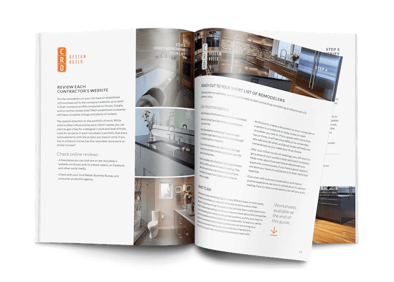
Guide to Hiring a Remodeler
This comprehensive guide walks you through all the steps of choosing who will design and build your project, vetting remodeling companies, and ensuring that you have the best experience.


